‘DEBRANDING’: WHY BIG COMPANIES ARE SIMPLIFYING THEIR LOGOS
Big businesses are trading in depth and detail for minimalist branding. You might have noticed that major names like Pepsi, Toyota and Mastercard now showcase notably simpler logos.
If you’re wondering why this trend is taking companies by storm, then keep reading to learn why less is more in present-day branding.
A hallmark of this new era in design dates back to 2013 when Apple ditched their classic skeuomorphic graphics for flat and simple app icons. Other tech companies swiftly followed suit—most notably Instagram and YouTube– forgoing realistic-looking camera and TV icons for their now-familiar yet more abstract badges.
As with any major shift, there were, of course, dissenters. Critics complained of new logos lacking character and even went as far as accusing creatives of laziness.
However, despite this, the wave didn’t stop. Companies of all sizes jumped on the bandwagon, releasing new logos and icons in droves. The trend lives on, even throughout the ’20s, with Burger King, Warner Brothers and many other big names continuing to debut flatter and simpler logos.
This movement has been dubbed ‘debranding’: the act of stripping away old design attributes and streamlining the subtle details that identify a brand.
Debranding is a marketing strategy in which brands move towards simplifying their logos, promotional materials and other identifying features. For example, debranding may include removing the company name from the logo, taking a 2D approach to graphics or working with simple shapes and minimalist colour pallets to create a cleaner and more streamlined style.
In a way, debranding is a form of rebranding, but the aim isn’t to overhaul the whole brand look or perception. Instead, companies are electing to preserve only the core of their identities, whether it be a logo outline or their defining colours, and build their new brand around these bare bones. Essentially, they’re clearing out the “fluff”, leaving behind only the essence of the brand they built.
We know brands are changing their logos, and we see the direction they’re all headed. But surely, there’s more to it than showcasing simple graphic designs. So, then why are big companies opting for minimalist logos?
As we move to smaller and thinner screens, we need to alleviate the “pressure” we put on pixels. This means limiting design density to ensure icons look crisp and stand out. Unsurprisingly, detail-rich graphics generally don’t display well when shoved into the tiny top corner of a mobile website.
This may be a modern movement, but in a way, it’s undoing previous advancements in design to return to the simpler styles of the past. Before the advent of computers, graphical artists favoured 2D logos and flat fonts with simple colour palettes. As software programs allowed for more complex designs, branding and graphics followed a trend of excess. Think shading, vibrant colour gradients and an abundance of 3D textures and shadows.
Although these designs looked intricate and novel on desktop monitors, we now know we must dial it back and tailor company logos to new forms of media.
Quite simply, designing flat logos is the trendy thing to do right now. Even brands that had relatively simple logos in the past are choosing to overhaul their branding to stay fresh and up-to-date. Since the big brands are doing it, we’ll likely continue to see more companies make the shift while new businesses also follow suit.
Although the aim is always to radically simplify the graphics, companies are taking different approaches to debranding. Tech giants tend to focus their efforts on creating a memorable icon or initial that serves to identify the brand. Take for instance Facebook and their ‘f’ or Instagram and their simple sunset-themed camera. There’s also Google with its familiar RBGY colour scheme.
Conversely, fashion designer, Ralph Lauren, has removed its memorable polo player from the logo and instead opts to state only the brand name on most marketing avenues.
Below, we share the three most popular styles of debranding and examples of companies taking each approach.
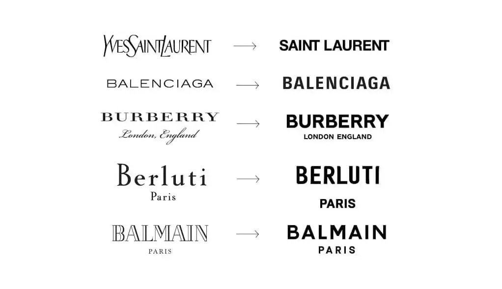
In this type of debranding, we see companies remove classic graphics in favour of keeping only the company name in a simplified format. Companies following this trend include Burberry, Prada and many other high-end fashion brands.
On the flip side, many companies are dropping their name from their logo and only showcasing a quintessential icon as their main identifier. This is especially popular among the most well-known brands, and it also serves to remind us of just how cemented their imprint is on society. With a few simple lines or shapes, we instantly recognize the reigning brand champs.
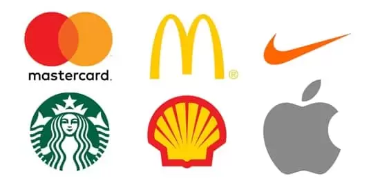
Brands that are adopting this style of debranding include Nike, Starbucks and Apple.
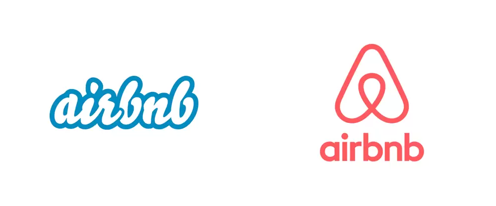
In this debranding style, companies opt for a more generic version of their original logos. For example, they may choose to keep defining shapes and their company name but instead aim to flatten, simplify and minimize their graphical footprint. This includes sticking to a two-tone colour pallet, using bold lines and removing any shading, highlights or depth. Examples of this style of visual evolution include Pringles’ and Airbnb’s latest logos.
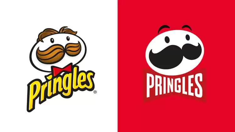
Big company logos are getting facelifts everywhere we look—from Pepsi’s flattened ball to the minimalist typesetting of top Parisian fashion brands. Whether it’s to improve digital branding efforts or simply follow a trend, the flat logo revolution isn’t showing any signs of slowing down.
That said, who knows what the next decade will bring? As the media we use changes, and potentially shifts to VR, 3D logos may make a comeback—in a whole new way.
Does your logo need a refresh?
Blue Ocean Interactive Marketing offers logo design and graphic design services as part of our creative offerings. Contact our team today to discuss re-envisioning your logo or to develop a brand identity for your new business.